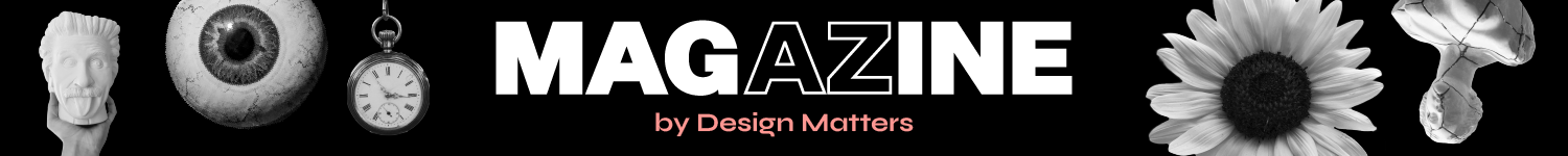

Each year, Design Matters reinvents its visual identity, not just to refresh, but to reflect the evolving spirit of digital design. Since 2021, that transformation has been in the hands of our very own Sara Bertova, Digital Designer, Content Creator, and all-around creative force.
Sara is the kind of designer every team dreams of. She is thoughtful, focused, endlessly kind and always, and always makes her deadlines. She meets every brief with care, turns abstract ideas into sharp visuals, and does it all with quiet confidence and a collaborative spirit.
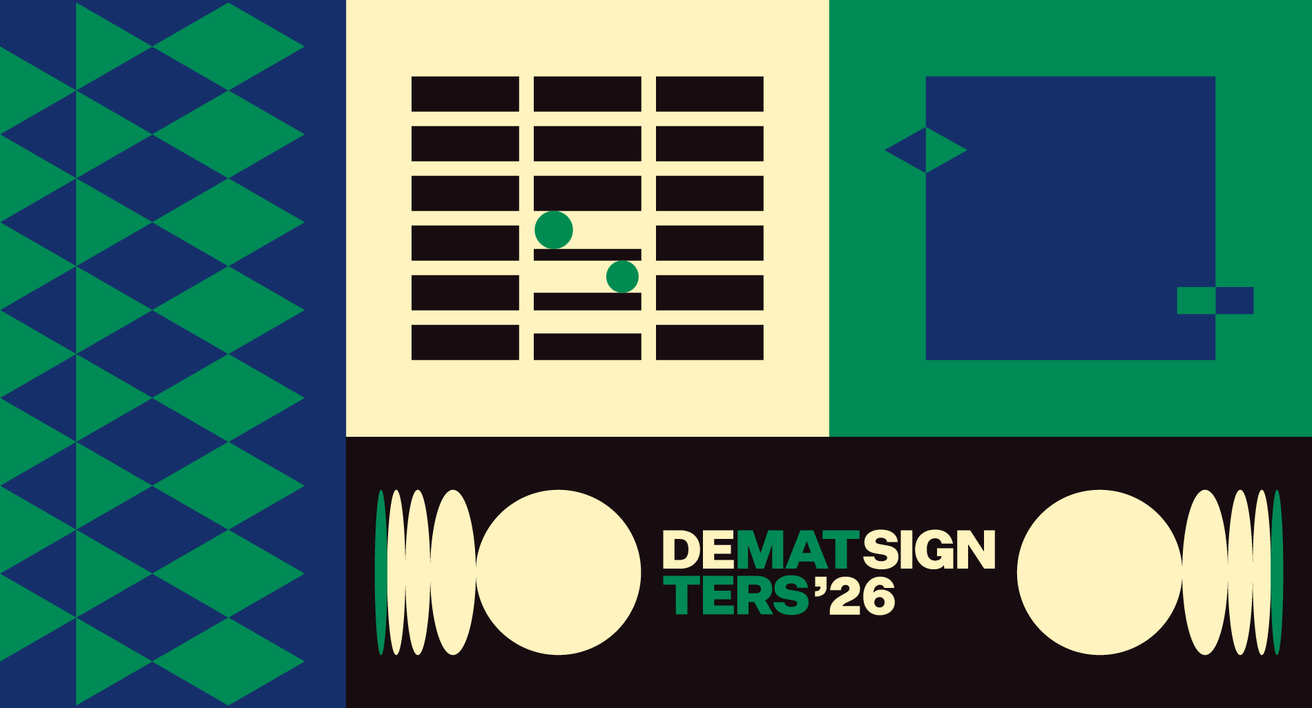
For DM ‘26, she’s created a visual identity that’s playful, precise, and full of personality, the kind that makes you feel the visual.
I spoke to Sara about her process, her challenges, and her thinking behind this year’s design.
Can you walk us through the core concept behind the Design Matters ‘26 identity? What was the spark that set the tone for the entire visual direction?
The core idea was basically “quiet sophistication meets digital nostalgia.” I wanted the identity to feel calm and understated at first, but with small details that reveal themselves the longer you look. I thought of the identity like a kind of memory; soft, slightly worn-in, familiar, but still very much alive for 2026.
The geometric theme became the main graphic language that tied everything together. The shapes are super simple on the surface, but when you layer them, repeat them, or animate them, they create this subtle rhythm that keeps the whole system feeling intentional without being loud.
That mix of softness, structure, and a little playfulness with a pinch of vintage vibe ended up setting the tone for everything.
This year’s identity feels “vintage cool, simple, muted, yet yummy. What influenced your stylistic choices? And how do they reflect the theme or mood of Design Matters?
I think the vibe you’re describing came from wanting something that felt both familiar and fresh at the same time. I kept thinking about how Design Matters sits between a lot of opposites: past and future, craft and tech, small community moments and big global perspectives; and I wanted the identity to reflect that without being loud or overly styled.
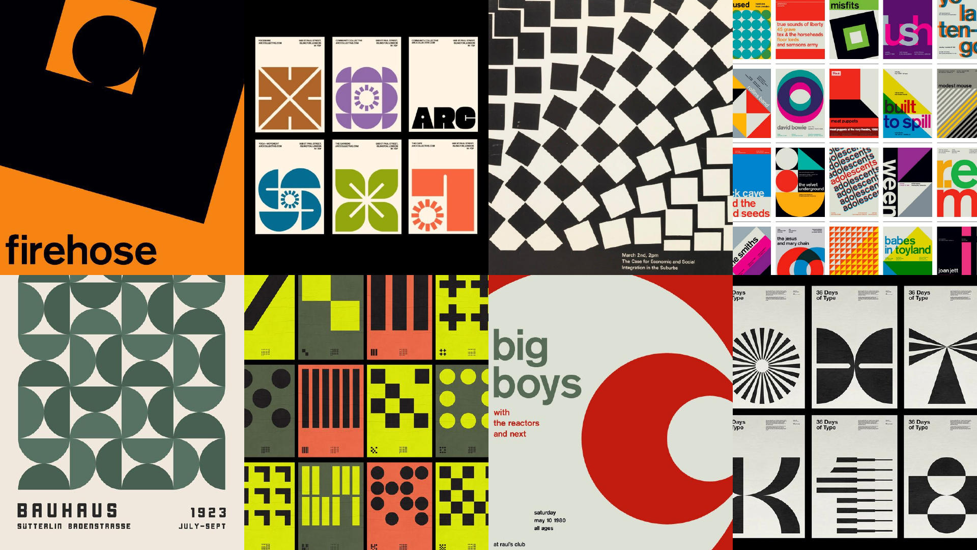
Design Matters usually has this high-energy, almost party-like aesthetic, but this year I wanted to explore what a calmer interpretation of that could look like. I was definitely influenced by older geometric design styles, where everything is built from basic forms but still carries a lot of personality. So the style ended up reflecting the quieter side of the Design Matters vibe, but still very much aligned with its spirit.
Design Matters is known for pushing the boundaries of digital aesthetics. How do you balance experimentation with clarity and usability in this year’s identity?
Design Matters identities always feel like a playground for maximalism and experimentation. This “playing around,” however, can sometimes lead you down the wrong path, one that drifts away from usability. Finding the balance between experimenting and creating a good user experience is always a central challenge.
On one hand, I want to push things, explore forms, animations, and textures to give the design personality and mood. On the other hand, I don’t want to compromise readability, contrast, and so on. I’ve definitely had moments in past projects where I later realized that the cool idea completely destroyed usability. So I try to be more mindful with every new concept.
This year, I went for a more minimalist approach. I tried to restrain the visual noise. I reduced the color palette and used subtle animations instead of loud, distracting effects. Small and expressive touches that add depth without sacrificing performance or overwhelming the user.
Were there any specific typefaces, colors, or design systems you used as anchors in the identity? Why did those elements feel essential to you?
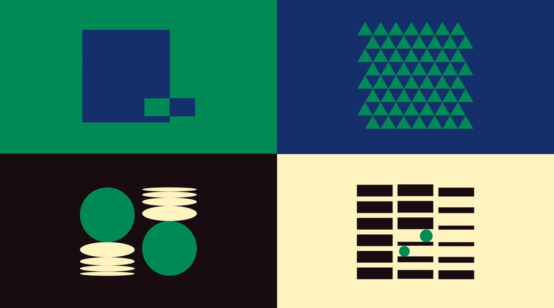
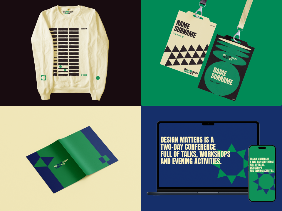
The main anchors for the identity were definitely the color palette and the geometric shapes. The four chosen colors, licorice, sea green, delft blue, and blond, set a really balanced tone. They’re muted but expressive, and together they create a calm, cohesive atmosphere.
For the visuals, I kept everything rooted in the simplest geometric forms, circles, squares/rectangles, and triangles. Limiting the system to those shapes actually opened up a lot of creative possibilities. By combining and layering them, I could build more complex compositions while still keeping the identity clean and consistent.
Those choices felt essential because they gave the whole system a solid foundation, structured enough to feel intentional, but flexible enough to explore different moods and layouts. Without them the visual identity might tip into being either too plain or too chaotic.
If you could pick one moment where the identity really ‘clicked’, what would it be? And what makes that moment or object stand out to you?
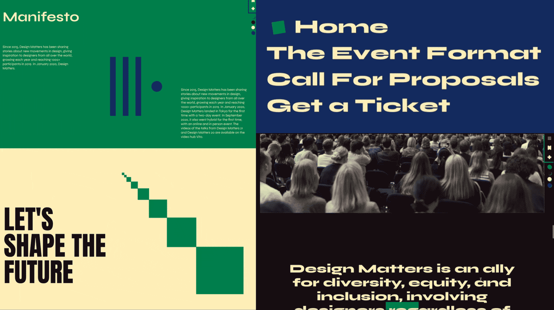
For me, the identity “clicks” when I see the synergy of everything together: color, type, graphics, and motion. I created a series of different mockups, and seeing everything side by side in both digital and print formats is usually where I understand whether a system actually holds up.
It’s important for me to try out not only how the different puzzle pieces fit together, but also how easy it is to work with them and come up with new ideas for layouts, animations, and so on. I imagine the future me, or anyone on the team, trying to use the elements to make a quick social media post or a newsletter banner. Can they do it easily? The geometric shapes are really rewarding in that sense. You can stack them differently and instantly get a new, unique visual.
So, the mockups were the first moment the identity felt alive rather than theoretical. It felt like the identity found its voice: not shouting, but whispering, “welcome in.”
What we learned:
Through thoughtful restraint and subtle playfulness, Sara Bertova has shaped an identity for Design Matters ‘26 that feels both familiar and quietly fresh.
Sara Bertova’s vision for the Design Matters ‘26 identity invites us into a world where “quiet sophistication meets digital nostalgia”. It’s a system built on soft geometry, subtle rhythm, and a muted palette. At every stage, Sara considered not just how things look, but how they function and designs with care, clarity, and a deep respect for usability.
Her restraint in color and motion allows small expressive details to shine, proving that a minimalist approach doesn’t mean minimal impact. From her first layered mockups to the final moments where the identity “clicked”, Sara shaped more than a visual language; she crafted a feeling. A design that doesn’t shout for attention, but gently holds it.
***
Find more of Sara on her LinkedIn
***