
Designing for a global audience starts with curiosity. It’s about stepping outside your own context and asking, “How might this feel for someone halfway across the world?”
The more we design with a global audience in mind, the more opportunities we create for people and for businesses. When design accounts for different languages, cultures, and ways of interacting with technology, it doesn’t just make the product more inclusive—it makes it more scalable.
This is also where a designer’s true impact shines, not just in pixels or prototypes, but in shaping how a business grows. Designing with internationalization in mind shows a deep understanding of both people and product. It’s the kind of thinking that goes beyond the screen, anticipating needs, reducing friction, and opening doors to entirely new markets.
Understanding Internationalization vs. Localization
Internationalization (i18n) is the process of designing and building a product so it can easily be adapted to different languages and regions without needing major engineering changes. Think of it as laying the groundwork—like using flexible layouts, supporting different character sets, and avoiding hard coded strings.
- Prepares a product to support multiple languages and regions.
- Implemented early in the design and development process.
- Focuses on flexible, scalable design systems and infrastructure.
- Aims for global readiness, not market-specific adaptation.
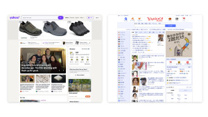
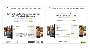
Localization (l10n), on the other hand, is the process of actually adapting that product for a specific market, translating text, adjusting date and currency formats, and considering cultural nuances. It’s where the product truly feels local.
- Adapts a product for a specific language, culture, or region.
- Happens after i18n is in place.
- Focuses more than just content, visuals, and functionality that feel native.
- Aims for local authenticity and usability.
Design Principles to Keep in Mind
Flexible Layouts
A flexible layout that accommodates text expansion and Right-To-Left (RTL) support makes the product more adaptable to diverse languages. It allows your team to quickly localize and scale across regions, minimizing design rework. Additionally, it prevents visual clutter, as longer words or additional characters don’t require adjustments to the overall layout.
- Design for text expansion (German vs. English, or Arabic vs. Chinese).
- Support Right-to-Left (RTL) languages.
- Avoid hardcoded sizes or directions (e.g., paddings, alignments).
Typography and Language Support
By choosing fonts that support a wide range of characters, you ensure that the product looks consistent across different languages and scripts. Avoiding stylized fonts that don’t support non-Latin characters ensures the product is universally accessible. Additionally, being mindful of tone, case usage, and cultural nuance in the copy helps avoid misinterpretation or offense.
- Choose typefaces with wide language support (e.g., Noto, Inter).
- Avoid stylized fonts that don’t support non-Latin characters.
- Be mindful of tone, case usage, and cultural nuance in copy.
Icons and Imagery
Using globally recognized icons (such as a magnifying glass for search or a heart for like) reduces the cognitive load for users. Universal symbols transcend language barriers and make the interface more intuitive. Moreover, providing alt text and descriptions for screen readers improves accessibility for users with disabilities, ensuring an inclusive experience for everyone.
- Avoid culturally specific visuals (e.g., hand gestures, animals, country flags).
- Use icons that are universally understood.
- Provide alt text and descriptions for screen readers in multiple languages.
Date, Time, and Currency Formatting
Using ISO formats or locale-aware libraries ensures that dates, times, and currencies are presented according to local expectations. This attention to detail contributes to the overall user experience, as users feel that the product respects their regional preferences. By avoiding static text like “AM/PM” or hardcoded currency symbols, the design is made dynamic and adaptable to a variety of locales.
- Use ISO formats or locale-aware libraries.
- Respect user preferences and cultural expectations.
- Avoid static text like “AM/PM” or “$” hardcoding.
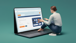
Forms and Input Fields
When forms are easy to use and adapt to regional conventions, it improves conversion rates by minimizing friction in the signup or purchase process. Providing region-specific input formats reduces user errors and abandoned forms, which can directly impact revenue and customer acquisition. Supporting these features also enhances the product’s inclusivity and shows that the company is serious about serving diverse markets.
- Support non-US addresses, names, and phone numbers.
- Allow multiple formats for numbers, ZIP/postal codes.
- Provide flexible dropdowns for country and language selection.
In Short:

One of the simplest ways to build global awareness is to explore. Browse inspiration sites like Mobbin, download apps from different regions, and study the details. Notice how language, layout, and tone change across cultures. Tools like Figma’s translation plugin or AI-powered previews can help you view your own designs through a global lens. They quickly reveal where things might break or feel out of place. The more you practice this, the more natural it becomes.
At its core, global design is inclusive design. When we create with the world in mind, we build better products. Not just for one market or language, but for everyone. And in doing so, we show that design is not only about meeting business needs. It is a powerful way to connect people across borders, with empathy and intention.
***
All visuals are created by Jian Wei.
If you found these insights beyond insightful, then you should see Jian Wei speak at Design Matters 25 in Copenhagen in June. If you want to prep for the talk then feel free to check out Jian’s platforms:
LinkedIn: linkedin.com/in/findjw