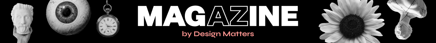

Repetition is not duplication. It is a way of thinking through form and gesture. In my work, repetition has been both the starting point and the process. The process often begins in graphic, two-dimensional design — obsessive, pixelated, built from units. As it moves into the three-dimensional, it extends into the product and interior design, where repetition remains a strategy for construction and expression.
Repetition as A Tool
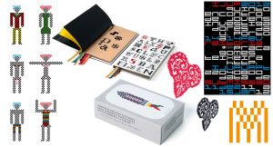
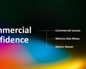
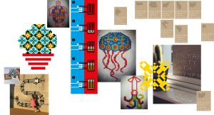
Over the years, I have explored the repetition of form as a visual tool. My approach stems from a matrix deeply rooted in Portuguese material culture, inspired by textiles such as cross-stitch, Arraiolos rugs, crochet, or knitting, and by surfaces like traditional tiles, Portuguese cobblestone pavements, or herringbone marble.
This logic of repetition — both visual and constructive — cuts across architecture, ceramics, weaving, and graphic design. As an organising system, the grid functions simultaneously as structure and language. From it, I explore visual compositions that both obey and break the rules. The grid, often regarded as a neutral or monotonous structure, becomes a field of tension between order, memory, improvisation, and rupture. The grid is not merely a physical support, but a performative surface: it structures, communicates, and transforms. It has never been a limit for me. It is a space of freedom, of interpretation and variation.
Visual Language — Structure to Spontaneity
My visual language oscillates between the methodical structure of the grid and the spontaneous expressiveness of gesture. The aesthetics I construct articulate tradition and technology through compositions that explore parallels between the handmade and the digital. Just as the pixel composes a bitmap image, the cross-stitch builds a textile, and the ceramic tile forms a facade.
Each unit contributes to the whole. It is within this modular logic, shared by ceramics, weaving, and digital imagery, that I develop solutions that challenge the predictability of repetition.
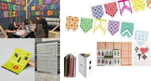
This visual thinking extends to other scales and contexts. The transition into ceramics occurred naturally. The tile is also a unit, a square, a grid. When repeated, it creates patterns, like an analogue pixel. This shift, from the digital, the flat, the ephemeral, and the visual, to the physical, the volumetric, the durable, and the material. Opens up new dimensions. When applied to architecture, the tile adds a further layer to the equation. Beyond visual composition — it is the properties of the material, its thickness, colour, texture, and finish that transform space. Not only embellishing it, but enhancing comfort for the user.
Colour: From Aesthetics to Performance
It is in this framework that my ongoing research project takes shape, focusing on the relationship between ceramic cladding and thermal comfort. The emphasis shifts from
surface aesthetics to environmental performance. Ceramics, as architectural skin, become both technical and sensitive systems — able to regulate temperature, absorb radiation,
and respond to the climate.
The repetition of the module remains, but now in service of a proposal where form, function, and performance intertwine. In many of my graphic projects, colour is applied with freedom and intuition, saturated, contrasting, and expressive — almost like a playful gesture. But within the research project, colour acquires a strategic dimension. It is studied and applied with technical awareness, recognising how form, hue, and finish affect thermal absorption and the perception of temperature in built environments.
Colour is no longer just an expression — it becomes regulation.
Circular Design — Between Geometry and Continuity
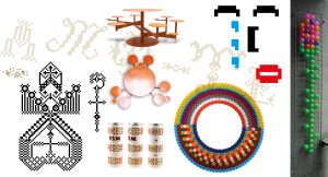
This modular way of thinking also extends into product design. A clear example is a table and a set of stools based on the repetition of a circle. The structure does not emerge from
an orthogonal grid, but from a radial repetition.
Complexity emerges from simplicity in a single shape, repeated with variations in scale and orientation. Circularity, within my practice, goes beyond geometry; it embodies a concept of cycle, permanence, and return.
This reinforces the ecological dimension that runs through my work. The reuse of materials such as discontinued products, industrial leftovers, imperfect pieces, and childhood objects is a recurring practice. This logic of repurposing reflects an ethics of circularity.
Sustainability is understood as the extension of the life cycle of objects. It challenges ephemerality by giving new life to what would otherwise be discarded. Reuse not only avoids waste but also creates pieces that evoke memory and emotional resonance, valuing what persists and reinvents itself.
The point, as a recurring gesture, becomes language. And the grid, when broken, reveals other ways of communicating and engaging with space. The systematic repetition of a single form generates dynamic surfaces, open to variation, improvisation, and the construction of singular visual identities. Within this repeated gesture lies a system that does not constrain, but liberates.
A path drawn dot by dot, a portfolio that brings together rationality and intuition, built between the precision of the grid and the fluidity of composition.
All visuals are created by the author, Marlene Couceiro.
*****
Website: https://marlenecouceirodesign.pt/
LinkedIn: www.linkedin.com/in/marlenecouceiro
Instagram: https://www.instagram.com/marlenecouceiro