Once upon a time, the future gleamed. It floated on chrome clouds, hummed with vacuum-tube optimism, and promised a life of smart kitchens, moon holidays, and problem-free lives. That future, of course, never arrived. But its look did, and in 2025 retrofuturism is everywhere to be seen in brands that glow like CRTs, in posters that quote space-age optimism, in interfaces that mix mechanical grids with soft neon gradients. Retrofuturism is less a prediction than a mirror, a way to look at our present through yesterday’s dreams. (Hmmm, very Black-Mirror-esque).
If futurism projects forward, retrofuturism projects back to the way we once imagined forward. Scholars tend to frame it as a creative movement that blends outdated visions of tomorrow with contemporary tools. Equal parts homage, critique, and remix. It lives at the intersection of nostalgia and possibility, balancing affection for old visual languages with a very modern awareness that every utopia has seams.

Why Now?
Because 2025 is emotionally noisy. Designers are navigating a new normal of AI-accelerated workflows, motion-forward content, and an audience that wants both escape and meaning. Mainstream reports have flagged a dual shift to more dynamic, motion-rich design and a concurrent craving for analog cues (grain, print textures, and handmade quirks) folded into high-tech polish. That hybrid sensibility shows up in trend roundups like Canva’s 2025 Design Trends report in “Analog Meets AI” and “Future in Motion”. And Vista/99designs’ callouts to bright, mismatched typography and maximal color reflect how retrofuturism sits comfortably inside that Venn diagram of being part tactile nostalgia and part techno-optimism.
There’s also a cultural reason why retrofuturism is a safe lab for speculation. When the real future feels contested (climate, regulation, AI ethics, etc.), designers can use past futures to prototype feelings such as hope, critique, and solidarity before committing to products. As the Financial Times noted, retrofuturist thinking re-surfaces whenever we need optimistic frameworks for living, working, and building under constraint. A quick field guide (for busy eyes)
Retrofuturism isn’t one style; it’s a constellation of stars.
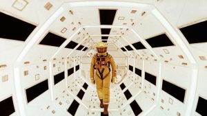

A few useful “stars”:
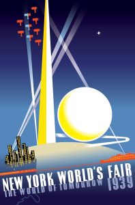
- Atompunk / Raygun Gothic (’40s–’60s): for example, streamlined rockets, boomerang shapes, telescoping antennas, glass domes. Think World’s Fair optimism and space-race propaganda.
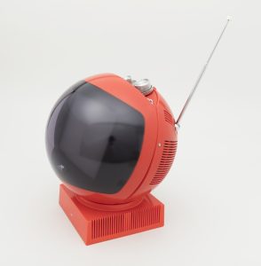
- Space Age product design (’50s–’60s): for example, appliances shaped like planets that are influenced heavily by the space race of the 1950s and 60s. Utilizing plastic, fiberglass, and chrome to create aerodynamic shapes with reflective surfaces on avant-garde products.
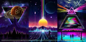
- ’80s synthwave / outrun: neon horizons, sun-stripes, grid floors, chrome type—retro-computer melancholy with a dance beat.
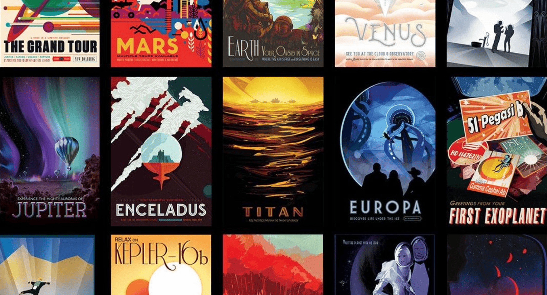
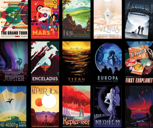
- Civic optimism posters, reimagined: the NASA/JPL “Visions of the Future” travel posters modernize WPA-era simplicity into space tourism daydreams. Equal parts science outreach and visual escapism.
The point isn’t to pick one lane; it’s to quote and remix. Designers can slip a videosphere silhouette into a hero graphic, use a WPA-like layout for a climate nonprofit, or put a vaporwave sky behind a very practical product page.
The Retrofuturist Toolbox (2025 edition)
1) Typography (squared and optimistic)
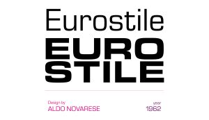
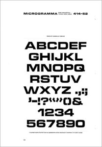
If there’s a “font of the future” burned into our collective brain, it’s Eurostile (1962), the rounded-square sans that colonized dashboards, TV title cards, and sci-fi key art for decades. Its predecessor Microgramma (1952) did the caps-only, techno-titling job. Eurostile added lowercase and breadth. For a serif-meets-sci-fi flavor, ITC Serif Gothic (1972) fuses stately letterforms with techno geometry.
2) Color (electric, but warm-blooded)
Neon and holographic gradients still earn their keep, but 2025 color wants for a little more depth. Such as metallic sheens, iridescent flourishes, and soft glows that feel tactile on OLED. The trick is balancing saturation with texture. L
3) Layout (order and exuberance)
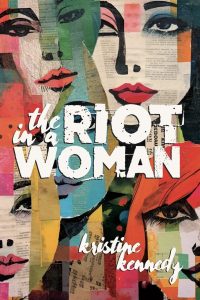
Retrofuturism loves grids. Literal ones, think laser grid on floors. Vistaprint’s graphic design trend article also points to “structured scrapbook” thinking. Meaning deliberately clashing of type sizes, bright contrasts, and odd juxtapositions that still respect rhythm. The result is controlled exuberance.
4) Motion (alive, but legible)
Think parallax stars, scanline reveals, analog noise overlays, restrained CRT flicker, UI micro-gestures that feel mechanical rather than squishy. Motion should suggest machinery, not just decoration.
Retrofuturism as Critique
All nostalgia is political, even neon. Retrofuturism’s sunny visions often erased whole populations and externalized costs (ecological, social, labor). Great retrofuturist work in 2025 acknowledges the gap between promise and impact. Use the style not just to escape, but to interrogate. Who gets to live in the future you’re drawing? Who maintains it? What does it cost?
Retrofuturism doesn’t ask us to believe in yesterday’s hype. It invites us to rehearse better futures, to borrow the courage of mid-century optimism without inheriting its blind spots. It reminds us that design is a tool for public imagination. In a year defined by AI breakthroughs and very human anxieties, retrofuturism gives graphic designers a practical brief: make tomorrow feel possible again, and make it look like we mean it.

